The best website layout is dependent on the purpose of the website and its content. What may be best for one site could be completely wrong for another. One-page website? Long scrolling pages? Following web layout best practices allows for flexibility in the exact design of each website so it can be tailored to best suit your audience.
It only takes 0.05 seconds for people to form an opinion about your website.
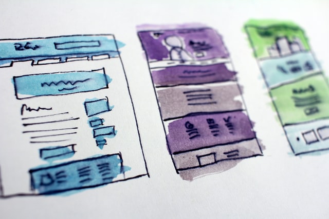
The layout of a website largely determines how visitors will consume and interact with the content presented on the site. An excellent web layout design will reinforce the content on the site while making it easier to consume and providing a positive experience for visitors. Patterns like card-based layouts, grid design, and asymmetry all our great patterns that can improve the user experience on your site and make your layout interesting and engaging. Adaptability of whichever layout chosen makes it possible for them to continue looking modern and on-trend.
Why do people visit websites? The primary reason behind each visit is content. Content is of paramount importance and every designer wants to present it in the most useful and intuitive way on their website. Selecting a layout for your content is one of the first things designers do when they start a new project. Many designers believe the web layout for every site they work on should be completely unique to satisfy the goals of the project — this is far from the truth. If you visit popular websites, you’ll notice that many of them use similar layouts. It's not laziness - it's the practice of tried and true ways of delivering a well crafted story.
3 Steps to Designing an Education Website Layout
Step 1 Think through the user journey first
Research and review analytics to think through the journey your audience will take to find your content. As you do your research, make sure you’re focusing relentlessly on your potential customers’ expectations. There are many ways to research user needs and expectations, but interviews, personas, and card sorting are probably the most popular methods. Once you gain a deeper insight into what your target audience expects from a page, you can start working on the information architecture. Good information architecture takes into account simplistic navigation coupled with call-to-actions and layout patterns that guide the user and reaches the ultimate goal: get to the destination in the fewest clicks possible. You achieve that with clear, concise, and useful language in your navigation bar and a consistent design throughout your site. Adding a backup feature like breadcrumbs can also greatly boost the usability of your site, helping the visitor understand their location on the site at all times. The last thing you would want to happen is a user leaving your site to perform a google search of your site's content.
Step 2 Strong visual hierarchy
User testing has shown that a website's audience often scans the page to quickly discern whether we’ll find what we need before diving in. Strong visual hierarchy can act as a guide to point users to the action you want them to take. Things like proper link text and use of buttons all play apart, but the layout is the main thing that encompasses things like buttons and accordions and can greatly impact the site's goals.
Here are a few ways to guide visitors to reading your most important content:
- Include the most important information in the first two paragraphs
- Use headings and subheadings
- Bold important words or phrases
- Group small amounts of related information visually
- Use bulleted and numbered lists frequently
Step 3 Call-To-Action Buttons (CTA)
Marketers would say they’re the most important element on the page and all efforts should be focused on getting people to interact with your site in this way, especially to drive traffic to other pages of your site. Strategic use of well-designed CTAs can greatly improve the flow of the page and guide the user toward conversion, so it’s critical to get this right.
Action items for the user when using CTAs are usually buttons or link text. Ensure your button links are clickable, adhere to best practices with text links (short titles that do not use 'click here' verbiage), and test out the destination after saving. When deciding whether or not to use a button versus link text (with an underline or color change), consider the button to be an action (like a form submission) and a link should only to be used to point to another page. Consistency is also key here, so be mindful of these important layout decisions and stick to a pattern for better web experiences.